I think we have all seen books covers that make us say, “Wow!” I also know we have all seen book covers that make us shake our heads. The former make us pick up the book while the later make us move away from the shelf.
Both are pretty extreme reactions. In some cases, our interest is piqued, while in others, we simply pass by without much thought.
Ideally we want the “Wow”, not the, “What were they thinking,” reaction.
That brings me to some tips you should probably follow when you decide on a cover.
Tip #1
Knowing how to use Photoshop (or any comparable graphics software) does not mean you are going to be able to create a good cover. Sure, it will give you the ability to put pictures and words on a page in a reasonable facsimile of a cover but don’t fool yourself into believing you now have a great cover.
Cover design is a skill that has certain rules around it. If you are determined to create your own covers, do some homework – look at covers that you think are outstanding and figure out how they are laid out. What fonts work, how much non-graphic space (I was going to say white space but most covers aren’t white) is typically there. What is the ratio of graphic to no graphic, for example. How big should fonts be? How many fonts is too many.
Lots to think about.
If you are still set on creating your own covers, consider these points as well: ensure the graphics you are using are free to use or require licensing. If licensing, you better know what the proper usage is for what you’ve paid. And, for goodness sake, get an unbiased person to tell you if the cover works or not (hint: your mother or bff or significant other may not be unbiased).
Tip #2
If you have decided to go with an actual graphic designer/cover artist, ask to see samples of their work. Don’t just go with the cheapest (you might get what you are paying for). There are LOTS of options. There are websites that sell pre-made covers. You might find exactly what you want there for little investment (again, ensure you can use the cover for promotional materials too). I have linked a fantastic article to The Creative Penn who has done a wonderful job listing many sources for covers. You might find others. She says many of the same things I do too, so you get that re-enforcement. 🙂
Tip #3
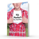
If you are planning a series, it doesn’t hurt to create the covers with some element of continuity. In my Mik Murdoch: Boy Superhero series, the covers are all very much the same (see below):


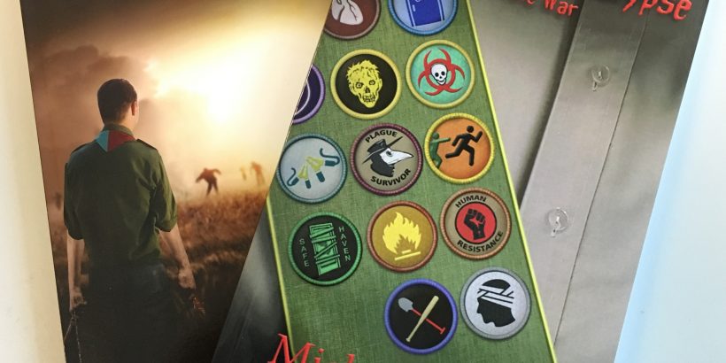
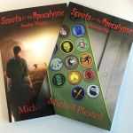
In my Scouts of the Apocalypse I use different cover images but tie the books together with similar fonts in the title (see below):
Tip #4
Research your genre. Different genres have different cover rules. For example, if you see a cover with a hunky male in a period costume, chances are good its a historical romance. Or, if dirigibles are flying in the background and you see gears and Victorian garb on characters, it might be a Steampunk novel.
Once you understand the cover rules of the genre, you can decide what the look and feel of your book needs to be.
Closing
Covers are your first impression on readers. You want something interesting and professional to grab their attention. A poor cover can kill any chance you have at selling your books.
Also, it’s important to realize that covers say something about your book. Pick the right look so your cover is properly selling the genre it represents.
Finally, get feedback from unbiased parties to pick the right cover for you book. You might get different opinions; should that happen to you go with the consensus.
Good luck!
